
Dashboard
The dashboard is your daily entry point into dAio Business. At a glance, it brings together the essentials of your activity — the status of your sites, the alerts in progress, and your organization's key metrics — so you know where to focus the moment you log in.
Its content adapts automatically to your role: an owner or administrator manages the organization from here, while a field member finds the weather and risks for their locations directly.
Tip: get into the habit of starting your day on the dashboard. Active alerts and site weather are surfaced first, before you even open the detailed sections.
What you see depends on your role
The display depends on your access level within the organization:
| Your role | What appears |
|---|---|
| Owner / Administrator | The metric cards (sites, API keys, members, plan), active alerts, and prompts to complete setup. |
| Member / Viewer | The weather and risk level of your assigned sites, along with the active alerts that concern you. |
Everyone therefore sees only the information relevant to their scope: a field lead is not buried under administrative metrics, and vice versa.
Key metrics (owner / administrator)
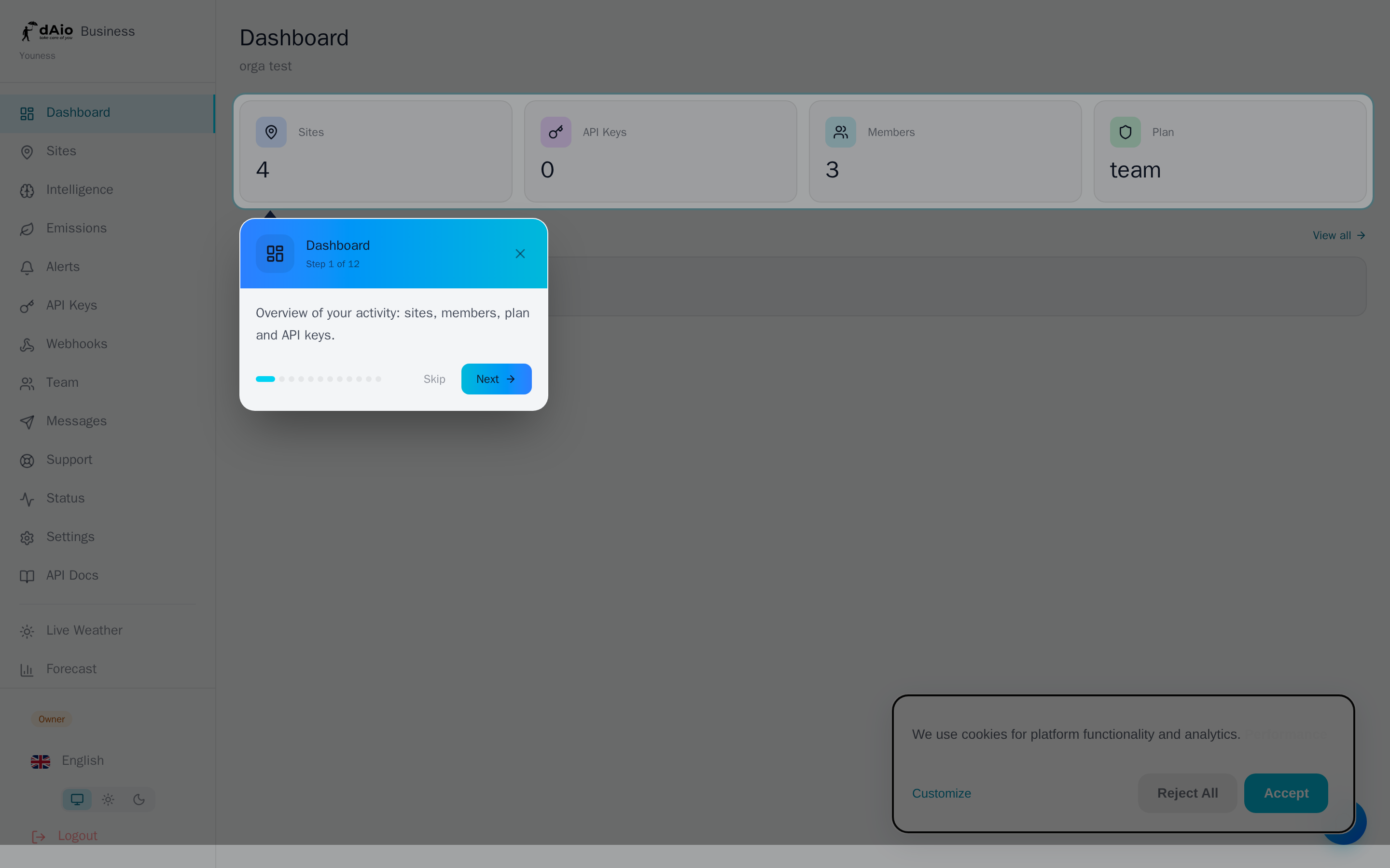
At the top of the page, four cards summarize your organization's health:
- Sites — the number of configured sites. Click the card to open site management.
- API keys — the number of active keys that let you integrate dAio data into your tools.
- Members — the number of collaborators in your team.
- Plan — your current plan (Solo, Team, Enterprise).
These cards are not just counters: they also serve as shortcuts to the corresponding sections.
Tip: a site or member counter stuck at a low value is often a sign of incomplete setup. Take the opportunity to finish onboarding your locations and your team.
Site weather (member / viewer)
If sites are assigned to you, the dashboard displays one card per location, with its current conditions:
- Overall condition as an icon (sun, clouds, rain, storm…).
- Current temperature, in degrees Celsius.
- Wind in km/h and relative humidity as a percentage.
- Risk score out of 100, when available, along with its level color.
Each card is clickable: it opens the site's intelligence, where you'll find the full forecast and the hourly breakdown.
Reading the risk score
The score, calculated for your industry, ranges from 0 (optimal conditions) to 100 (critical conditions). Its color dot allows for an immediate read:
| Level | Color | Read |
|---|---|---|
| Optimal | Green | Favorable conditions, no particular constraint. |
| Low | Cyan | Light caution, limited impact on activity. |
| Moderate | Amber | Worth watching, plan accordingly. |
| High | Red | Marked risk to your operations. |
| Critical | Deep red | Severe conditions, action required. |
In addition to the score, each card may display up to two contextual messages:
- Warnings (⚠, in amber) flag a weather constraint to anticipate.
- Opportunities (✓, in green) indicate, on the contrary, a favorable window to schedule your work.
Tip: a moderate score paired with an opportunity is often the best time to bring forward a weather-sensitive task. Open the site's intelligence to confirm the window hour by hour.
Active alerts
The Active alerts section lists the alerts currently triggered across your sites (up to five, the most recent). For each one, you see:
- a dot indicating the nature of the alert — ✓ (green) for a favorable condition, ⚠ (red) for a risk;
- the alert name;
- the site concerned;
- where applicable, the predictive horizon, that is, the number of hours of lead time for the alert.
The View all link opens the complete list of alerts. If no alert is active, the section does not appear — a sign that all your sites are in the green.
Getting started and setup
Until your workspace is fully configured, the dashboard guides you:
- An onboarding checklist suggests the steps to complete in order to get the most out of the platform.
- A guided tour introduces the main sections on your first login. You can skip it at any time.
Contextual help messages also appear when a building block is missing:
- No site configured — an administrator is prompted to add a first site; a member is informed that no site has been assigned to them yet.
- No API key — when sites exist but no key has been generated, a shortcut offers to create one to integrate dAio data into your systems.
Trial period
During your trial, a badge displayed next to the organization name shows the number of days remaining.
Warning: when the trial expires, full access is suspended but no data is deleted. Take out a subscription to regain all features. Your sites, alerts, and history are waiting for you, intact.
Navigation and shortcuts
The dashboard is designed as a launch pad to the rest of the platform:
- Click the Sites card to manage your locations.
- Click the Members card to open the Team page.
- Click a weather card to open the site's intelligence.
- Click View all to access all your alerts.
Best practices
- Check the dashboard first each day: it prioritizes the urgent (alerts) and the important (weather, risks) for you.
- React to the color dots: an amber or red card deserves a look at the intelligence before any field decision.
- Handle warnings with a predictive horizon as a priority: they give you time to act before the event.
- Complete the onboarding from the start — sites, team, and API keys — so the dashboard becomes genuinely informative.
- Assign your sites to the right members (see Sites) so that everyone finds exactly the locations they are responsible for on their dashboard.
Tip: the dashboard gives you the overview; to go further, dive into a site's intelligence, fine-tune your alerts, or track your emissions.